HOST APP


Summary
I worked on this project for a freelance client. I was tasked with creating an app for hosts to use while renting out their properties on service that was to compete against products like Airbnb.

Role + Team
I designed this process myself from information provided in a creative brief. After the project, I was responsible for quality checking other designer's work and merging app flows to create a cohesive product.

Tools
•Sketch
•InVision
•Principle
PLANNING PROCESS
USER PERSONA DRAFT
I began this project by empathizing with the user and creating a persona around their needs to form a foundation for the project.
I created a persona around a more casual user of this app, because although the app would have analytics and more data intensive features, these features would need to be navigable by data gurus and casual users alike.

USER PERSONA IN SKETCH
After I drew out my user persona, I composed it in Sketch to develop a more comprehensive characterization of this app's core user.

DESIGN PLANNING
After the persona, I consulted my scope of work to generate ideas and direction for the project.
From there, I planned out a user flow with pen and paper based on the notes I made while reviewing the project.

USER FLOW/JOURNEY MAP
This user flow also includes some aspects of a user journey to illustrate the tasks a user has when landing on a page.
My client seemed to appreciate these types of flows more, because it was more clear what a user was thinking on a page and the possible goals and destinations.

ILLUSTRATED WIREFRAMES
I always get feature ideas when I draw user flows, so next I took to sketching wireframe ideas to include in the digital product.


DIGITAL WIREFRAMES
This client preferred more HiFi wireframes, so I tailored my deliverables to his preferences.
ANALYTICS WIREFRAMES
A challenge with this project was creating a product with easily digestible analytics, so I took design cues from software like Google Analytics and Looker to craft an accessible experience.
I also wanted to make these insights actionable, so I included an edit button after the "tips" section, so hosts could optimize their listing in one click.


BOOKING WIREFRAMES
I aimed to facilitate guest + host interaction through the design of the app to ensure the smoothest experience for both the guest and the host.
I made the guest itinerary and chat thread accessible from the calendar, so that if the host needed to quickly interact with the guest after reviewing their booking, they were able to do so with the fewest amount of steps.


LISTING MANAGEMENT WIREFRAMES
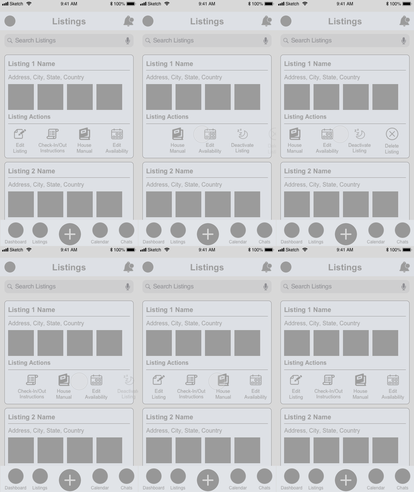
Having strangers in your home could definitely stress some people out, so I tried to facilitate edits to the listings as much as possible to make the host feel like they had maximum control over their property. I also included a feature to apply calendar edits to multiple listings, so the host wouldn't have to edit each listing individually.


RESERVATION WIREFRAMES
The chat section of the app houses all communication between the host and guest. I utilized tabs here to categorize the phase of each guest and ensure overall clarity. Here, the host can also accept new reservations and even offer them discounts


PROTOTYPE DEMO
Feel free to take a look at the prototype I put together in InVision below!

MERGING PROCESSES
This client had a network of designers working on different flows for the app.
After initial wireframing, I was put in charge of quality checking the other designer's flows for consistency and editing the processes so that they created a cohesive experience.
CHALLENGE: MAIN NAV CONSISTENCY
Users can switch between the host app and the main app through a button nested in the profile section.
I noticed an inconsistency in the overall experience here, because in the original design of the host app, you access the profile through the top nav. However, in the main app you access the profile through the bottom nav.

Through the main app, users switch to hosting mode through the bottom nav.
*Work of another designer


In the hosting app, users switch through the top nav, which houses the profile option.
*Work of another designer
SOLUTION: REFORMAT HOST APP NAV
My client initially requested that the bottom nav of the host app have a "+" button to make it easy to add a listing.
However, after some thought I realized that wasn't consistent with design best practices, because it didn't share equal weight with the other nav options. Most users wouldn't need to add listings every time they opened the app, but they would need to navigate between their profile, dashboard, listings, calendar and chats.


NEW BOTTOM NAV
I altered the host app's bottom nav to be more consistent with the main app experience and also to retain user behavior, like tapping the far right option in the bottom nav to access the profile.
Design standards also dictate that the bottom nav destinations be equally important so this also justified the choice of including profile and excluding "+."
PRESERVED EFFICIENCY
I moved the "+" button to the profile section's old home, which meant that listing another property was still just 1 touch away.
I also reformatted the profile menu to be more consistent with the app's UI while keeping it simple and intuitive to switch between the host app and the main app.


